
When people look at American Civil War photos in colour, the reaction is often immediate. The war stops feeling like a chapter in a textbook and starts feeling like something lived by real people with tired eyes, worn uniforms, muddy boots, and families waiting at home. That shift matters. The National Archives notes that the Civil War was the first large and prolonged conflict recorded by photography, while All That’s Interesting argues that colorized images restore a sense of immediacy that old sepia photos can lose for modern viewers.
A big part of the power comes from familiarity. Black-and-white and sepia images can create emotional distance, even when the subject is devastating. Colour changes that. A blue Union coat, a red-brown beard, a pale face, or the green grass around a camp makes the image feel closer to the visual world we already know. That is why colorized photographs of figures like Abraham Lincoln, George A. Custer, or unnamed soldiers and families often feel less like relics and more like encounters. TIME described its colorized gallery, created by Swedish artist Sanna Dullaway, as offering a contemporary perspective on the war’s most iconic images.
One reason these images hit so hard is that colour strips away some of the museum-glass effect. In black and white, a soldier can feel like a symbol. In colour, he looks like a young man who had skin, hair, posture, and a face that belonged to an ordinary human life. All That’s Interesting makes this point directly when it says colour can remind us that someone like William Tecumseh Sherman was a flesh-and-blood person, not just a famous historical name. That same effect applies even more strongly to unknown soldiers, wounded men, or civilians caught near the edges of the war.
The emotional pull gets stronger when the subject is not a general or a president. A colorized portrait of an unidentified African American Union soldier with his wife and daughters, or a camp scene filled with exhausted men sitting outside a tent, feels intimate in a way that goes beyond formal history. In TIME’s gallery, images like Robert Smalls, Lincoln at Antietam, Confederate prisoners at Gettysburg, and a family portrait of a Union soldier in uniform all become easier to read as human lives, not just as evidence from the past.
Colour also changes how we notice detail. Once an image is colorized, viewers often pick up textures and contrasts they would have skimmed past before. The blue of a jacket, the dull shine of a brass button, the redness in a face, the gray of a coat, or the difference between earth, wood, leather, and skin all become easier to separate. That is part of why these images can feel so vivid. They are not magically more truthful in every sense, but they can make the physical world inside the photograph easier for us to enter. All That’s Interesting says this kind of colorization can make old photos feel revelatory rather than remote.
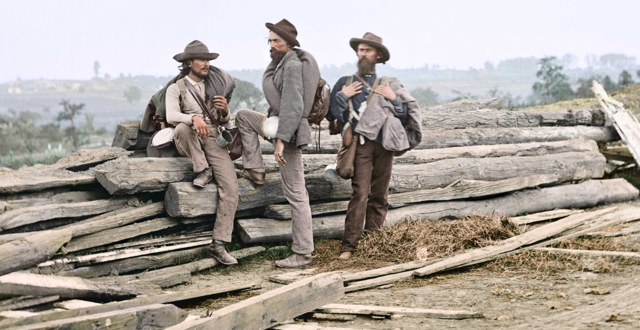
That visual clarity matters even more because Civil War photography was limited by its own technology. The National Archives explains that wet-plate collodion negatives required exposures of 5 to 20 seconds, which meant there were no action photographs of the war. What survives instead are portraits, camp scenes, councils of war, battlefield aftermaths, hospitals, civilians on the move, and the dead left where they fell. Because the camera could not freeze combat itself, the emotional force often lives in everything around the battle rather than in the battle charge. Colour helps those quieter details speak louder.
There is another reason these photographs feel so powerful. They are still. That stillness can be more haunting than motion. We are not watching a reenactment or a film. We are looking at a frozen moment that someone actually stood inside. The Journal of the Civil War Era notes that images of battlefield carnage, camp life, and studio portraits still stimulate an emotional response and remind viewers of the human cost of war. In other words, the photographs do not need movement to carry weight. The silence inside them is part of the effect.
When colour is added to those still frames, the emotional contrast can get even sharper. A dead soldier at Gettysburg or an amputee photographed after injury can feel more disturbing in colour because the image no longer hides behind the abstraction of monochrome. It feels less like history at a safe distance and more like a person whose suffering happened in the same visual world we live in now. That is why these images often stay with people long after they have scrolled past them.
The most affecting Civil War images are not always the battlefield ones. Sometimes they are the portraits meant to be sent home. The Journal of the Civil War Era points out that hand-colored tintypes were an affordable alternative to painted portraits, usually costing between 25 cents and $2.50, and that soldiers often sent these photographs back to loved ones. That detail changes the way you look at them. These were not just historical artifacts. Many were personal objects carried through fear, distance, and uncertainty.
That older tradition matters because it reminds us that colour and the Civil War are not only a modern digital project. Some nineteenth-century images were hand-tinted in their own time. So when we talk about American Civil War photos in colour, there are really two stories. One is modern colorization, which helps present the past in a form that feels immediate to us. The other is period hand-coloring, which shows that people living through the war also wanted images that felt warmer, more alive, and more personal.
It is worth saying one thing clearly. Colour does not magically make an image more objective. Any colorization involves choices. Artists and restorers study uniforms, skin tones, flags, materials, and period objects, but they are still interpreting the image. That does not make the result fake or useless. It just means the power of these pictures comes from a mix of history and interpretation. TIME’s feature makes that visible by naming Sanna Dullaway as the artist restoring and colorizing each image, while the original photographs remain credited to figures like Mathew Brady, Alexander Gardner, Timothy H. O’Sullivan, and the Library of Congress.
That balance is part of what makes the best colorized Civil War images so compelling. They do not replace the original photographs. They reopen them. They invite viewers to slow down and notice things they may have overlooked the first time, whether that is the face of Lincoln at Antietam, the proud stance of a soldier in a studio portrait, or the exhausted posture of men sitting outside a tent between campaigns.In the end, American Civil War photos in colour feel powerful because they collapse distance. They make the nineteenth century look less sealed off from us. They remind us that the war was lived by people who were not abstractions, but bodies, faces, families, and fears. And once colour returns that sense of nearness, the emotional weight of the images becomes much harder to ignore